Burnett and Marshal published their book in 2003, which maybe one of the reasons why the authors and view Yahoo! a little bit different than how I view Yahoo!
Since Burnett and Marshal published their book, I believe that the internet was changed the way we look at things or at least that the people have helped changed the way the information is presented to us. I personally believe, we (internet users) have changed the way we like to look at stuff and most of us will prefer something that grabs our attention with images, videos or music over something that presents the information in a simple yet not exciting way.
 |
| Yahoo! Main Page in 2003 |
After reading the work by Burnett and Marshal, I can say that the way they looked at Yahoo! back in 2003, is different than how I view Yahoo! now in 2010. The authors divided their critique into three different categories and two stages. During the first stage, color and contextual dimensions were evaluated. Yahoo! back in 2003 had the Yahoo! symbol right on the center of the page in bright red color with a very distinct font, while the rest of the text on the page was regular black and no full sentences were observed on display of the page. In 2010, however, the symbol of Yahoo! remains written in a funky way but it is not in the center of the page and is not red, but purple. Now I would ask myself why the change in color and in location would matter, but the way I look at it is, that back in 2003, Yahoo! was battling against other pages in search of recognition, and if you somehow landed on the page, the makers of Yahoo! wanted to make sure that you knew that you were using their services. In 2010, Yahoo! has no need to battle with other companies just over a name, the makers are now focusing on having their users know, not that they are on Yahoo! but that Yahoo! provides you more results than other search machines (You see, the Yahoo! symbol was moved to the right of the page and was replaced by a search bar).
In one of my earlier paragraphs I had mentioned that people are changing the way internet is presented to us. The reason why I say this is because we now live in a word where visual appeal will have an impact on how you view a web site. Back in 2003, Yahoo! was pretty boring with less than a few images and with a boring Times New Roman lettering. Burner and Marshal stated in their work that Yahoo! makers probably excluded as many images from the main page, because images were heavy and as a result they slowed down the loading of pages. But of course, the internet was slower back then. In 2010, visual images, videos and sounds have taken over many pages including Yahoo! and information for the most part is now presented in very interesting and appealing ways.
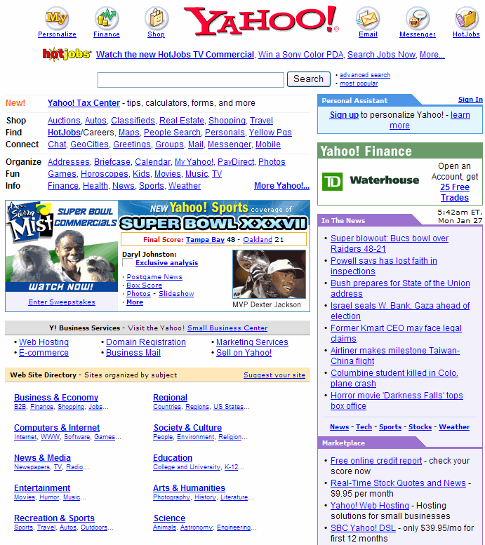
 |
| Yahoo! Main Page in 2010 |
During the second stage of Burnett and Marshal’s critique, they analyzed the links showed on the main page, the user’s ability to personalize, interactivity between the user and other users or between the users and the site and the interplay of different media forms. Now on this second category, I would say that there wasn’t been much of a change, Yahoo! still promotes other pages though the use of links, and the user with an account can personalize what information is presented to him/her and how it is presented. The main observable change in the page is of course the addition of more and more categories and the change in their order as people began requesting and using other services. I say this, because back in 2003, Yahoo! had six main categories from which to choose from, while now the Yahoo! user has about 18 categories shown. Quite a change!
On a final note, Burnett and Marshal stated in their work that “the more financially endowed the site, the more likely that… standard techniques of interaction are operating” and I do agree with that statement to one level (Burnett and Marshal). It is true that in 2009, Yahoo! partnered with Microsoft and therefore the organization increased its financial stability, giving the site the opportunity to keep up all of the services offered, but I personally believe, as stated before that the user is the one who draws on for the different changes on a web site and not only the funds available for the development (the funds are important too, but with no request, no need to develop, right?). What the user prefers to use, how it is presented and how it works in part depends on the user who either supports or not supports a certain feature of the site. Yahoo! and other websites are up and working thanks to the user interaction and they have to adapt to what the user prefers and how they prefer it, otherwise the user will simply go to another page that offers what he/she wants to see and use. In the end, the user has a voice...

Works Consulted:
Burnett, Robert, and P. David Marshal. Web Theory: an introduction. New York: Routledge, 2003. 95-101. eBook.
Goldman, David. "Yahoo-Microsoft Search Deal Gets Final OK." CNN. 18 Feb 2010, Web. September 9, 2010. http://money.cnn.com/2010/02/18/technology/yahoo_microsoft/
Garcia, excellent analysis! I can't comment on it all but just want to ask you about how reading has changed. Do you think the Internet organization is influence how books (print) are produced too?
ReplyDelete